
The main issue we face is a lack of analytics expertise and data literacy. This should not come as a surprise, since becoming proficient in these areas takes years of hands-on experience. Now, tools are emerging to help bridge that gap. What are their features and how can they be implemented in a BI (business intelligence) tool?
There are three fundamental pillars to a quality reporting system. There’s comprehensive, accurate and timely data, content, which is relevant, clear, and actionable. Finally, it’s important to deploy the right tool, to manage data and content, and facilitate customization and collaboration. Anyone wanting to make data-based decisions must first have these three in good working order. Once these fundamentals are met, the next logical question is: What can I do better? And, what does better mean?
First we must recognize a wide spectrum of users or personas. On one end are the consultants, analysts, and other data nerds (like me) who love spending time in a business intelligence (BI)tool digging through data for insights. On the other end are general business users. These folks typically prefer a short synopsis of what’s happening, why it’s happening, recommendations for change, and a forecast of said change. They want quick solutions that enable smarter decisions and, frankly, would be more than happy to never log into a BI tool. In this blog we focus on the business users who make up the vast majority of BI users.
So…what does “better” mean for these business users? Up until recently the push has been for more data, more visualization, and more self-service. There is one big flaw in this—it requires users to become data and reporting experts (data nerds). This type of analytics literacy takes years of hands-on effort to perfect. Currently, there’s counsel we can provide with standard reporting content (dashboards), clean and organized data, and an accessible and efficient tool minimizing the need for reporting expertise. However, there are powerful new features which can be leveraged to bridge the expertise gap. Each of the below features are at various stages of development and have benefits and challenges for users.
Generative artificial intelligence
Throw a stone in the desert and odds are you’ll hit someone talking about the impact of AI in any given business scenario. It’s a hot topic and for good reason. There are huge upsides to integrating AI into a reporting system. Starting out, these systems will act like a new analyst straight out of university. While they might not understand the nuances of corporate travel, they will understand statistics, analysis, and content building. We are now able to ask simple, natural language questions and get an AI generated outcome. AI will go out, query data, pull in the relevant measures, attributes, and filters, and then present it visually.
Machine learning
An AI analyst can correctly infer what you mean by the key words input or be open to feedback. For example, I can ask, “What is my spend this year?” Sounds simple, but AI must infer the right data to pull.
Specifically, what is “spend?” Is it total spend? Base spend? Should it exclude voided tickets and include only originals?
What does “my” mean? Is it a specific issuing country or business unit?
What does “this year” mean? This could be a booking date, issue date, start date, or end date.
Just like we would for a new Analyst, we can now ask a question and provide iterative feedback and follow up questions so the tool can learn our preferences for future use.
Of course, while the tool is continually learning we should be in the habit of verifying output anytime an AI system is used.
AI Highlights
I, for one, am guilty of not wanting to read an email that is far too long. Instead, I ask the AI integrated into my email to summarize the long chain. This is no different than what is possible with dashboards. AI can provide us with key highlights from a report that usually requires an analytical eye and lots of patience to decipher expected or unexpected changes and the overall impact they have had on the program. Just like with machine learning algorithms, we can trust the output but must always verify.
Natural language recommendations
Part of getting good AI highlights isn’t just about getting relevant information on your desired measures, it’s about getting said information in a digestible format.
For example, to the casual user a regression analysis in Excel might as well be written in ancient Sumerian.
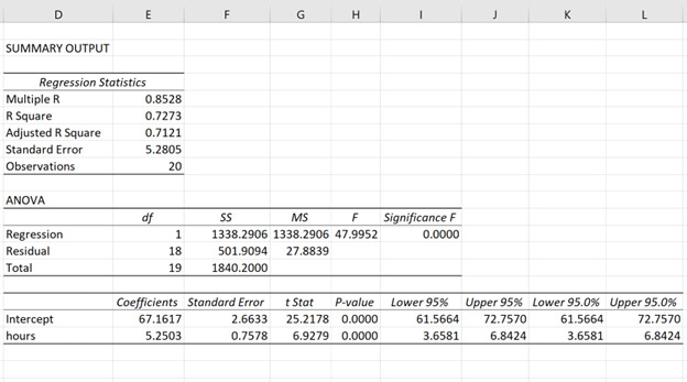
Caption: Regression analysis in Excel
Instead, business users can now ask new tools to run analyses in which the output explains the correlation, trends, outliers, and even forecasting in basic language enabling even the most entry level user to easily grasp deep insights from their data. Some AI might even include automated charts to help visualize information.
Automated analysis
Imagine this: You open a dashboard and see that your online adoption has suddenly dropped week over week. Previously, you might pull a data extract and run a bunch of tests through the probable KPI culprits to identify the cause. Instead, we can now simply select two points on a chart and have the BI tool run a change analysis to identify both the leading causes of change and whether the change was statistically significant.
Correlation, trend, and outlier analyses are other great examples of this sort of automated analysis. My favorite is outlier analysis. It’s a great way to identify bad data or misbehaving travelers. I’ve personally seen the impact of this while showcasing it to a customer. The outlier analysis identified travelers with a higher than average spend per trip based on their distance flown and hotel nights.
Forecasting (predictive)
Forecasting is a Pandora’s box. Ultimately, applying a forecasting model is not one-size-fits-all. There are innumerous forecasting models and choosing the perfect setup for your data requires time, effort, and expertise.
While most of us do not possess an abundance of these three things, we can still apply basic models that fit most instances. The important part is a process to validate that historic predictions end up within your accuracy threshold. If you are unable to quality check the accuracy of your model, the model should be viewed as unreliable and discarded or replaced.
There is a direct correlation between the time, effort, and expertise given to build forecasting models and their accuracy. So, set your expectations based on your willingness and ability to devote yourself to these three things.
Finally, at the absolute highest level possible, there are two types of forecasting models: quantitative and qualitative. Quantitative forecasting requires hard data and number crunching. Qualitative forecasting relies more on educated estimates and expert opinions. Realistically, our best models should be a combination of the two. For example, if you only use a quantitative method and suddenly there was a global pandemic mandating all travel be stopped, your model would do a very poor job at forecasting solely on historic patterns. Instead, you would need to incorporate the recommendations of experts for more realistic outlook.
What-if (Prescriptive)
‘What-if’ scenarios and prescriptive analytics add an additional layer of complexity to the already tough task of forecasting. For most of us, this sort of advanced analytics is unfortunately out of reach.
However, we can much more easily conduct what-if scenarios looking backwards at historical data which is often an equally valuable exercise.
Many modern BI tools allow for placeholders or parameters within formulas. The result is a dashboard that allows users to toggle things like: “What would have been my total spend last month if travelers had booked online 5% more often?” or “How much would my CO2 emissions decline if I had shifted 500 trips from business class to premium economy?”
This sort of feature helps us easily quantify the impact of changes, big and small, on our most important KPIs and is critical as a point of reference when enforcing travel policies.
Maximizing the value of your travel data starts with accurate data, relevant content, and a tool that customizes insights to your needs. While data experts enjoy exploring complex data, most users prefer concise insights and actionable recommendations. Fortunately, new tools like generative AI, machine learning, AI highlights, natural language recommendations, automated analysis, forecasting, and what-if scenarios are bridging this gap to help users quickly access insights and make informed decisions. As these tools evolve, they promise to make BI more accessible and effective for everyone. Stay informed of their benefits and potential shortcomings to enhance your decision-making processes strategically.
To learn more about the opportunities, risks, and challenges of similar GenAI solutions, read Emerging Technologies in Corporate Travel.