
In the immortal words of lead singer Ed Robertson, “It’s all been done.” This certainly applies to reporting content, whether it is a simple table or an interactive dashboard. Consumers of data, generally, should never have to work from scratch. You should be provided with a library of content that fills most of your reporting needs. In most cases, if you want to report on something, someone else has already done it. So, why not leverage existing content and reduce your workload?
If your current reporting partner is not providing you with standard content that fulfills the majority of your needs, you have a reporting gap. For example, CWT customers have access to 45+ dashboards within our growing reporting library, focused on key topics like:
- Program Summary
- Program Detail
- Sustainability
- Booking Behavior
- Real-Time Analysis
- Price Optimization (reprice)
- Unused Ticket Tracking
- Hotel Rate Suppression and Availability
- Safety & Security
- Data Assessment
- Supplier
Your reporting partner should be an expert on not only the nuances of how to use raw travel data, but also the best way to use that data to tell a relevant, clear, and actionable story. It should tell a story that uncovers trends, patterns, and anomalies that may require attention or action.
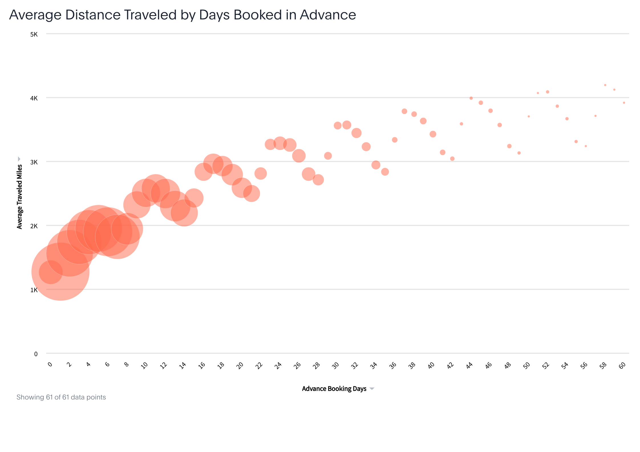
My favorite example of this is reporting on Average Ticket Price (ATP) vs. Advanced Purchase Days. The common belief is that flights are generally cheaper the further out they are booked. But that’s not the case if we look at it from a 10K foot view. Instead, we see average ticket prices increasing the further out we book. The simple answer is that there is a direct correlation between the cost of a flight, its traveled distance, and its advance days booked. Essentially, if I need to travel internationally from Minneapolis to Singapore vs. a short trip from Minneapolis to Chicago, I’m more likely to book my flight a month in advance. We can see this relationship shown in the below chart. For extra credit we see an undulation of average traveled miles by advanced booking days, which tells us another interesting story about how booking volumes and behaviors are impacted by the day of the week.
(Click the image for a larger version)
All this to say that creating compelling and useful content requires a deep understanding of the business context and the objectives of the user. Content creators must be adept at selecting the right metrics and key performance indicators (KPIs) to track, employing appropriate methods, and choosing the best visualization techniques to convey the message effectively.
While CWT’s expansive base content meets the needs of most users, it also serves as a solid foundation for those looking to build more sophisticated reports. The capabilities of the tool that houses the content, should enable that next level of customization—which I’ll delve into on the next blog, so stay tuned!
See also the 2 other blog posts in this series about travel reporting:
Top Tool: What should we expect from modern reporting?
Fine Figures: How to get the most value out of your travel data